Lim-Portfolio
Economist: 2020 Democratic Primaries
A. Critique of Original Viz
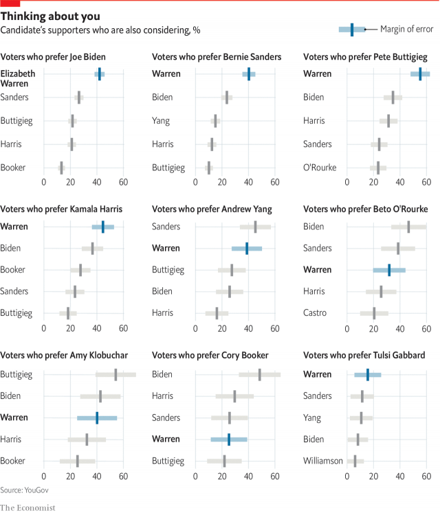
It is a very comprehensive chart that is made up of smaller sub-charts showing the level of popularity of the presidential candidates among the different subgroups. Their labels are very clear to guide the readers to understand the meaning of the bars, especially the titles in the sub-charts. I like their use of gray and blue to highlight the level of popularity of Senator Warren. We can see that she is the top 2nd choice in the supporters of her rivals.
The layout and the use of color help to boost the usefulness and completeness as readers can tell the main point of all the charts using the highlighted data points. After reaching this conclusion, the comprehensiveness of the charts also encourages the readers to find out who is the 3rd choice or the 4th choice, so on and so forth which increases the engagement score.
However, the readers are likely to take some time to reach the conclusion.
-
Readers have to figure out what is the differences between the horizontal bar and vertical bar of each candidate which is pointed out by the legend.
-
I do not feel that the margin of error needs to be added as normal readers would not know the significance of the margin of error unless they are trained in statistics. Having the margin or error helps the truthfulness because it paints a more accurate picture. But if the readers do not understand it, it is likely to be unnecessary data that take away attention time.
-
While there is a completeness of data, there might be too much data just to prove the support of Senator Warren. The important information is the relative rank of Senator Warren which is being the top in most of the sub-charts. But in order to get this idea, the readers have to read the title, the bars, and axis of every sub-chart. As such, this increases the time taken to fully understand the chart.
In conclusion, the completeness and truthfulness of the visualizations lead to more unwieldy layout of data which is harder to keep track; hence lowering the perceptibility, intuitiveness and aesthetics (trade-off).
B. First Cut
Elizabeth Warren Is Popular Among the Supporters of Other Democratic Presidential Candidates.

I chose the alluvial diagram to show how the presidential primary votes flow from the top choice to the next most popular candidate (2nd choice). It is supposed to show how Elizabeth Warren is quite popular as the 2nd choice candidate among the Democrats. Only Warren is labeled blue as she is the focus of this data. The rest of the data will be in gray to reduce attention to it.
Based on the feedback from others and my own reflection, there are improvements to be made:
-
The direction of reading is unclear. Is it from left to right or vice versa or bidirectional?
-
Is there any meaning to the size of each bar? Since they look the same, does this mean Warren has equal supporters from each 1st Choice Candidate? Additionally, what is the value ascribed to each bar?
-
Terms used such as 1st choice candidate, most popular non preferred candidate might be too specialized. It assumes the contextual literary of audiences who will be familiar with such terms.
-
The title is vague (How popular?). Change the title to make it more clear and impactful- “Warren is the most popular”.
-
It was also mentioned that it is unclear why this chart matters to a layperson.
-
Warren is the most popular 2nd choice candidate but her bars are at the bottom of the chart. This creates dissonance.
C. Second Cut
Elizabeth Warren Might Win The Nominee By Being The Most Popular Second Choice Candidate
Among the Democrats
% of Most Preferred Candidate’s Supporters (Democrats Primary Voters) Who Are Considering

Based on the feedback given, I made the following adjustments to my first draft:
-
In order to make the direction of reading more obvious and standarized (from left to right), the axis label will mention “1st choice” on the left and “2nd choice” on the right.
-
The size of the bar is now proportional to the percentage of the 1st choice supporters who are also considering the 2nd choice candidate. The larger the percentage, the larger the size. The percentage value is also included within the bar.
-
Axis labels are modified using more normal words to be better understood by casual readers. 1st choice candidate is referred to as the most preferred candidate first which is less technical.
-
The title is changed to be even more specific and included the impact of being the most popular 2nd choice candidate. This is so that readers can find the chart to be more useful.
-
Warren’s bars are shifted to the top to emphasize the popularity of the 2nd choice candidate.
The feedback was very useful to help me make my chart clearer. When I did my first draft, I thought I have translated the idea of the original visualization into my version. After the feedback from my friends, I realize the idea from my version may not be understood by other readers. This taught me about the importance of asking for feedback and not assuming that others have the same perspective as me.
For example, I was questioned about the purpose of this chart to a layperson and the technicality of the labels. This was important feedback as my target audience is the same as the Economist. They are the casual readers of current affairs who are essentially layperson. Therefore, I made my title more insightful by including the impact of Warren’s popularity and use more normal words for my labels.
Different readers can also have varying ways of looking at the same chart. For instance, out of those who gave feedback for me, one of them looked at the chart from the left to right while the other one was looking at it bi-directionally (from left to right and right to left). This reminded me to make my charts with as little ambiguity as possible, by putting cues in the axis labels and changing the size of the bars.
Ultimately, I hope that my second draft can show how Senator Warren can benefit from being the second choice among the Democrats even if she is not the most preferred candidate for some group of primary voters. She is able to get support from 5 out of the 10 supporter pools which are unmatched by other candidates. In most of the supporter pools, she can get as high as 40%-55% of supporters which is sizable. This huge support disparity is highlighted using the width of Warren’s blue bars which stands out in my chart.