Lim-Portfolio
Final Project Part 1 Version 1
Final Project Part 1 Version 2
GitHub Link
A.Outline
High-level summary: The United States is not prioritizing on the right solutions when it comes to dealing with the problems in the healthcare industry.
I find that the discussion on healthcare reforms in any country tend to be domestic in scope. It would have been better if international examples are brought in for a comparative analysis.
I will be using a model that I have modified for my undergraduate thesis to derive insights for the US healthcare system. This model is comparing the healthcare system of 30 OECD countries and Singapore. My story will be using lessons learned from this model to see if the current debate on the US healthcare reforms is in the right direction.
Aim
As a reader, I want to lobby for a more sensible healthcare system so that I can receive better healthcare quality and experience lower healthcare cost.
Another aim is to see if I can redesign my original visualizations to make it better for consumption by the general public. I want to test if I can make academic research more acceptable to them.
Structure of Storyline
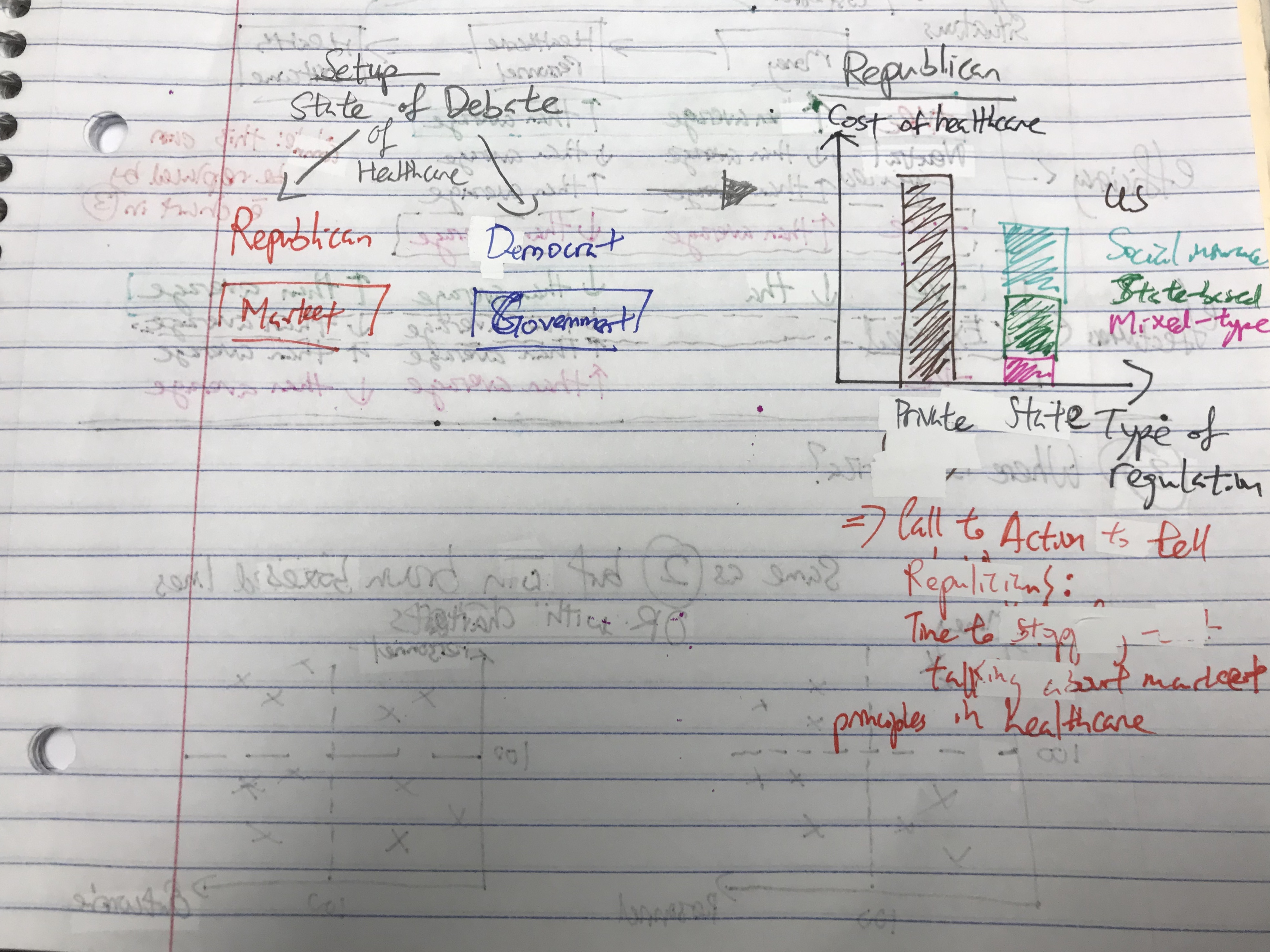
- Setup: This is the current debate on healthcare system reforms (Republican vs Democrat)
- Conflict 1: Republican ideas are not aligned with the conventional healthcare policies worldwide.
- Conflict 2: Democrat idea of Medicare-for-all might not work as well as planned.
- Resolution: There are better ways to reform the healthcare system (e.g. focusing on primary healthcare)
B.Data
The main dataset I am using is from my undergraduate thesis research. Other data that I am still looking for related to the resolution and Medicare-for-all portion.
Academic Website
PDF Acess to my Thesis
Healthcare System Type (Böhm, K., Schmid, A., Götze, R., Landwehr, C., & Rothgang, H. (2012). Classifying OECD healthcare systems: A deductive approach. TranState Working Papers,165.)
Raw dataset
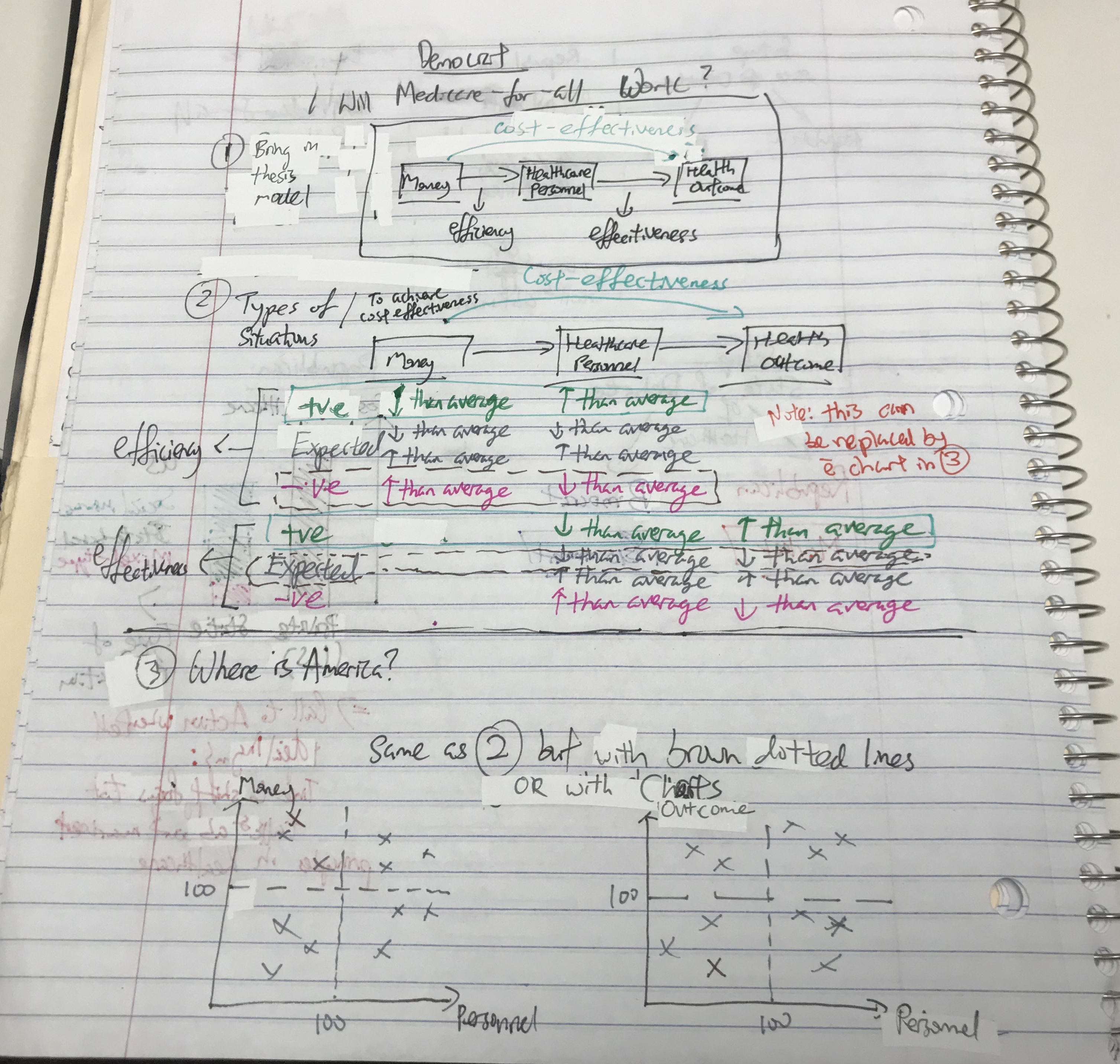
Picture A was the model that I worked on in my thesis. Each step in the model contains several indicators.
-
Monetary input –> Total health expenditure as a percentage of Gross Domestic Product (GDP); Expenditure on a per capita basis and government’s share of the expenditure. Taken from [WHO (2013). Global Health Expenditure Database.] (http://apps.who.int/nha/database/Select/Indicators/en)
-
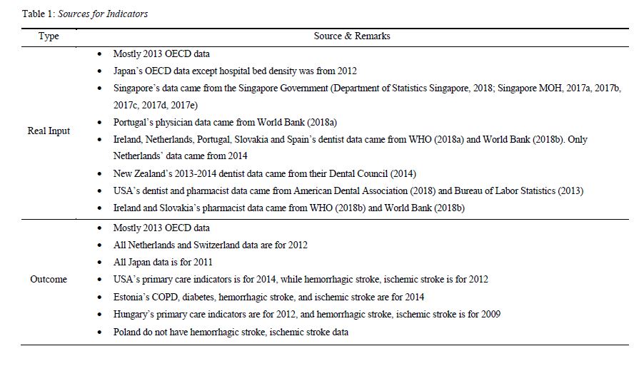
Real input –> number (per 1000 population) of healthcare personnel of hospital bed, nurses, physicians, dentists, and pharmacists Taken from 2013 OECD data unless otherwise stated in Picture B below.
-
Real output –> health outcome. Taken from OECD’s Health Care Quality Indicators project (HCQI) unless otherwise stated in Picture B below. Half of the real output refers to primary care and other half refers to acute care.
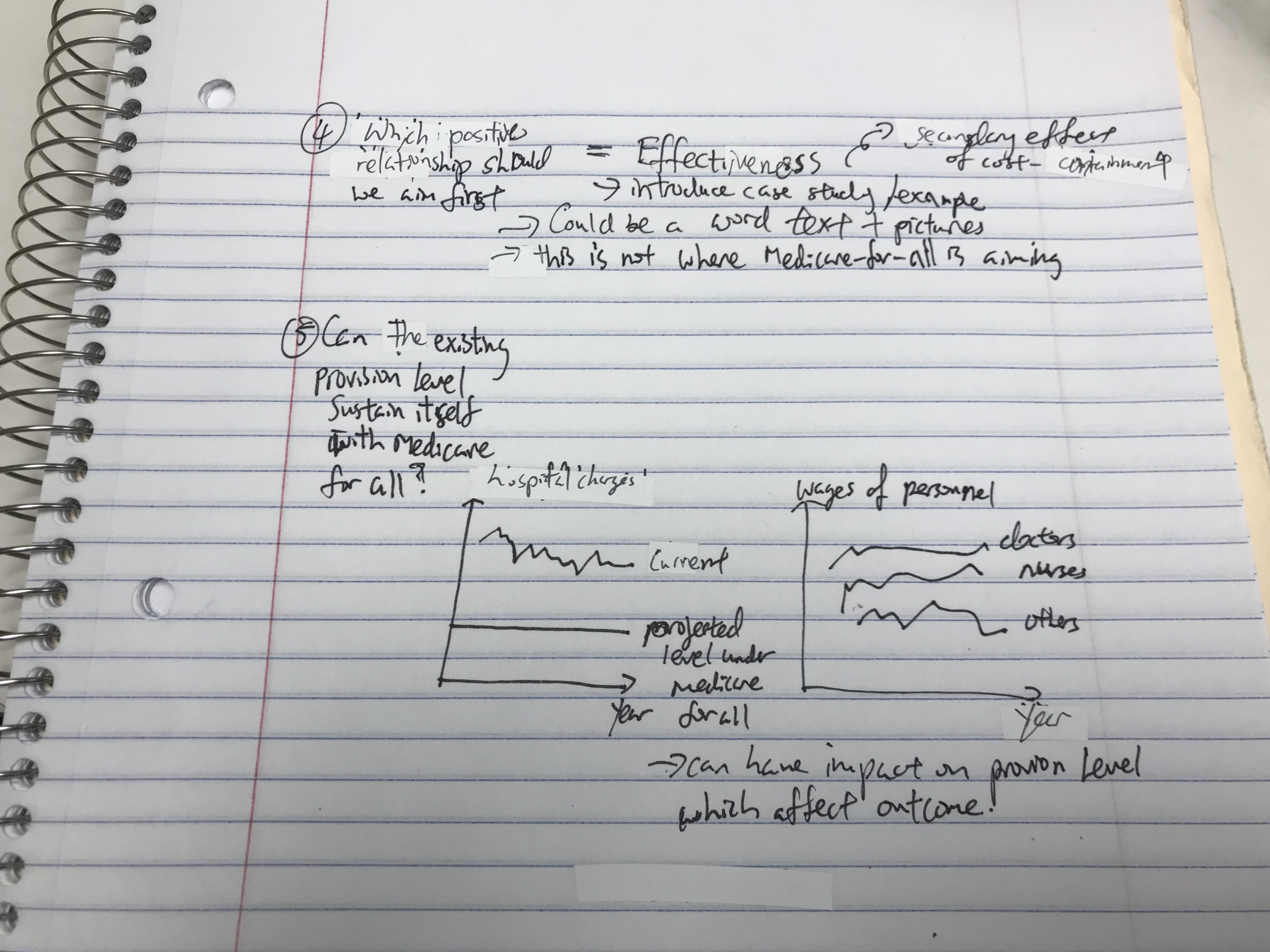
This model was used to compare the different health systems. E.g. the ratio between monetary input and real input of USA is compared to the UK to see how efficient the money is used to pay for healthcare provision.
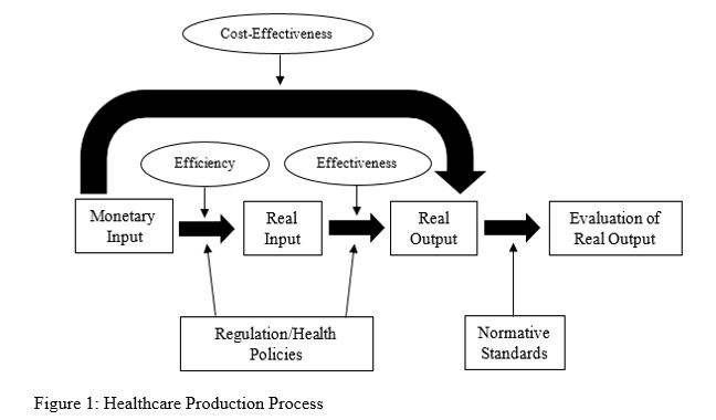
Source A: Taken from my thesis; Adapted from Wendt, C., & Kohl, J. (2010). Translating monetary inputs into health care provision: A comparative analysis of the impact of different modes of public policy. Journal of Comparative Policy Analysis, 12(1/2), 11-31.
Source B: Taken from my thesis; for the exact citation, refer to my thesis pdf.
The existing visualizations will be redesigned as it will probably need to more streamlined to be more persuasive. Currently, they have too much information and less specific to the US audience. The visualizations will focus on how America perform relative to the other systems. Depending on the length of the story, I might be doing a deeper dive into the ‘regulation’ indicator to see if there are additional insights for America.
C.Method and Medium
I will be using Shorthand to show my story. Tools like datwrapper, tableau, and rawgraphs will be used to create the charts needed to drive my story. The plan for the next two weeks are:
- week 1: generating the charts with story outline for feedback
- week 2: refine the charts and story outline; transferred it to Shorthand
D.Initial Sketches